CloudCME is a leading LMS for hospitals and universities nationwide.
I helped them reimagine their faculty task management portal implementing an interface that increased user productivity and client interaction, boosting overall satisfaction.
My role
UI and design
Wireframing and Mockups
Coding, development, and delivery
Results
Increase in user productivity
Increased page traffic
Overall increase in site satisfaction
Challenges
Don't make me think
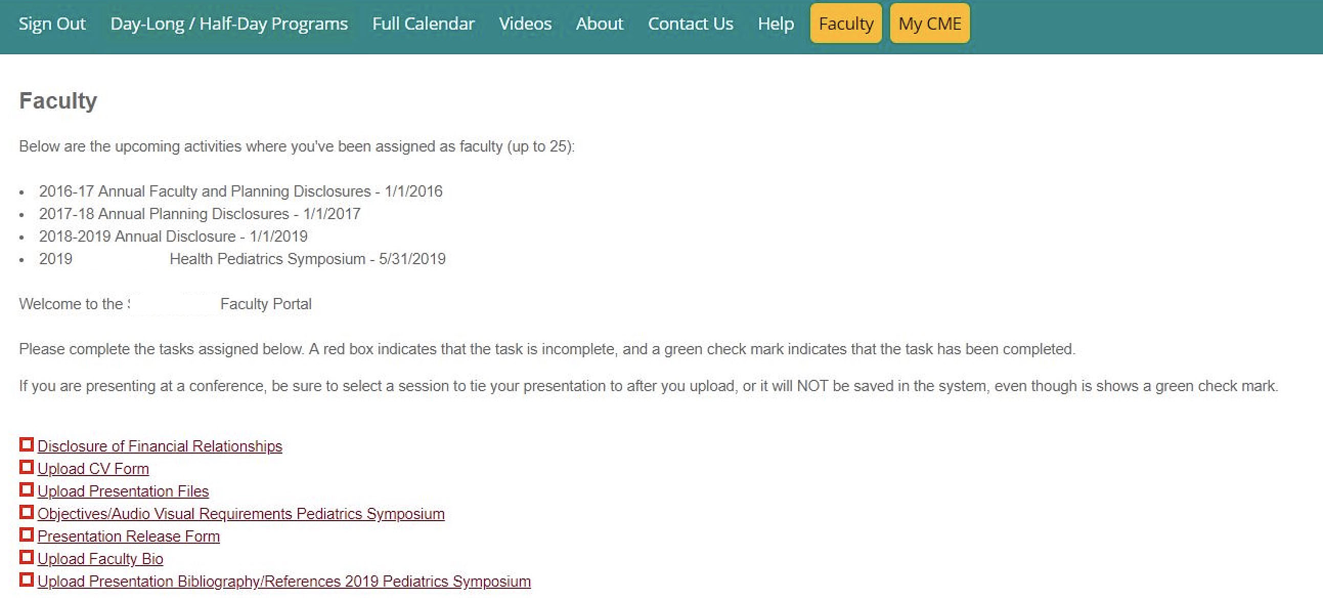
The first thought that came to mind me when viewing CloudCME's faculty portal was, this is very outdated and confusing. How was a user supposed to know what to do? First lesson in UX 101, don't make me think. Forcing a user to read a wall of text to decifer how to use a screen is a recipe for disaster. This page was in need of a redesign and stat.

Original CloudCME faculty user portal
Approach
Defining the goals
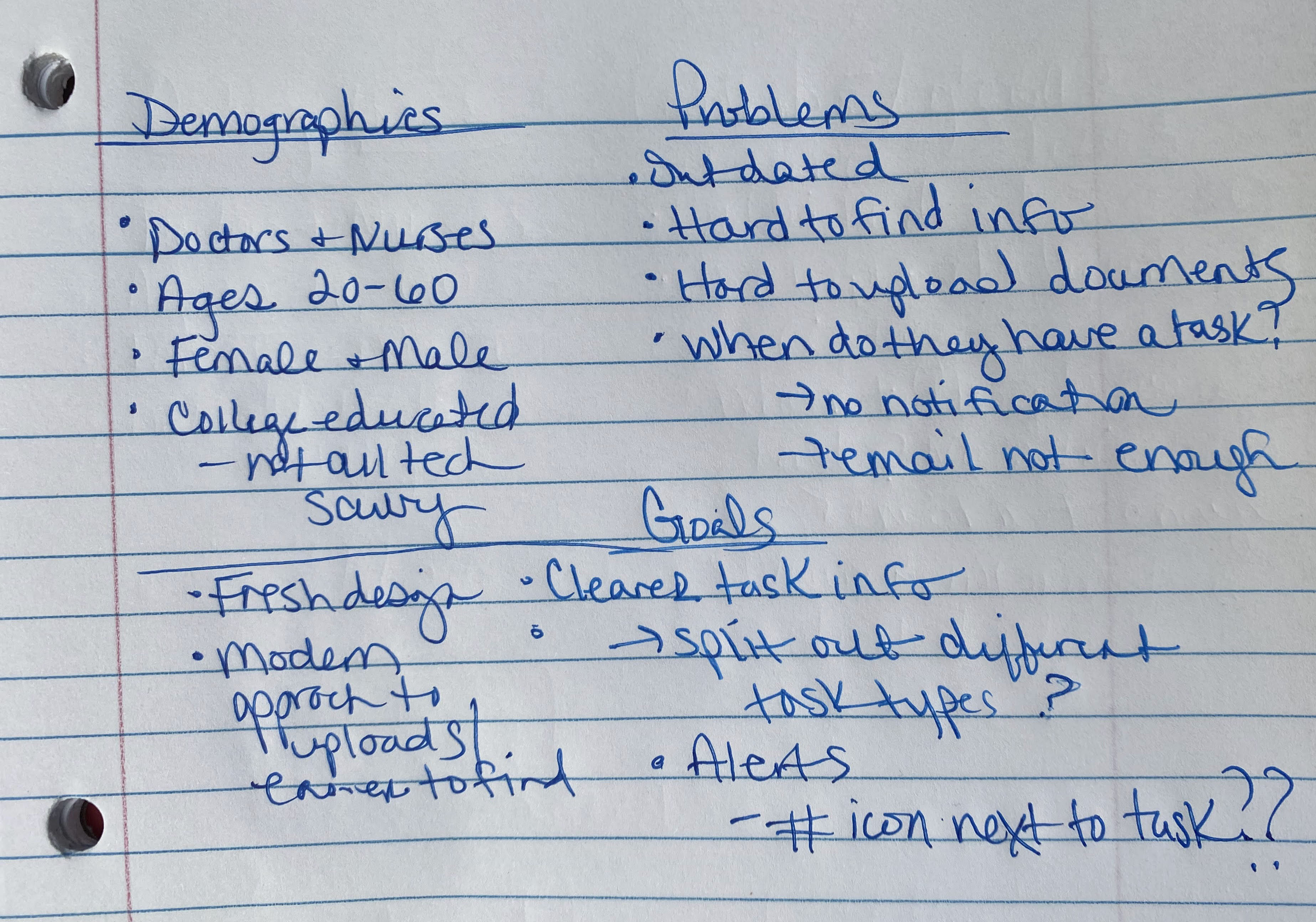
Before I approach a project and start sketching, I like to first define what the goals are. What is it that we are trying to achieve? What issues are solving? Who are we designing for? These are questions that are imperative for any successful project. It doesn't matter how pretty or innovative a design is if it doesn't solve the problem at hand.
For CloudCME, their faculty users had these complaints: it wasn't easy for them to find where to upload supporting documents, many tasks had an expiration date that wasn't clear, nor did they receive any notification that a task had been assigned to them.
The main goals I set out to meet were to create an more modern interface where users could easily see they had tasks that needed their attention, a clearer expiration date for tasks, and an easier way to upload documents. I already had some ideas forming in my head just by jotting down the main issues that needed addressed but now came the fun part...designing.

Initial notes
Results
A collaborative effort
After meeting with the client, sketching and wireframing, we unearthed some additional business requirements that were a must-have for the new design. Now personally, I love when this happens! It's the whole reason behind discovery calls and wireframing. The client was able to envision the process and user flow and contribute their business knowledge, interjecting with any missing pieces.
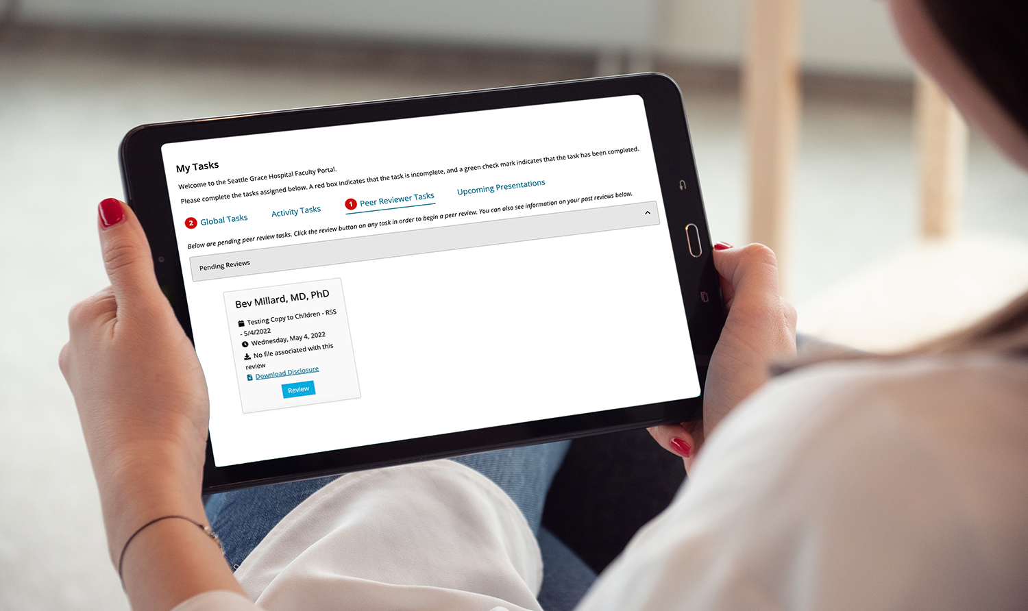
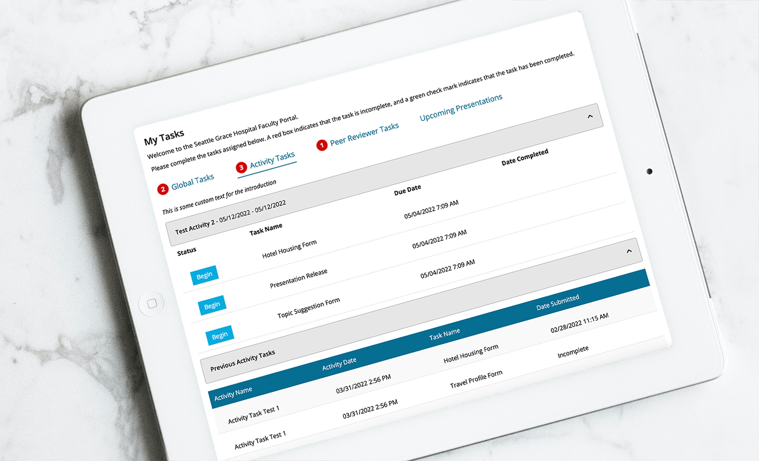
The collaborative effort resulted in a final design that was more modern with clearly defined tasks, expiration dates, and actions.

Instead of throwing all tasks in a list on one screen, I opted for tabbed approach that split the tasks into different types. One of the business requrements that arose from discussions was that not all tasks were created equal. Some were dependent on user permissions. Not all users would or could have the same taks showing. From there the tabbed approach was born. Global taks and Activity task tabs were for all users while Peer Reviewer and Presentation tasks would only be visible to users that had those permissions.
Additionally to meet the requirement of receiving task notifications, I implemented an alert approach. When a task was due or had been assigned a red counter bubble appeared next to the task tab indicating how many tasks needed completed. The total number of combined tasks that needed completed were then displayed in the navigation next to the faculty menu notifying the user there were tasks that needed attention as soon as they hit the website.
